Attention All Strategy Gamers: Call of War 2.0 revamp is here!
The anticipated release of Call of War 2.0 is finally here and it’s bringing interface changes and revamps to both mobile and desktop versions of the game.
After months of teasing the release of Call of War 2.0, the moment for players to jump in, start new battles, and join forces with other strategy enthusiasts has finally arrived! We listened to our community feedback and our team got ready to release a completely revamped and redesigned UI and map. Naturally, Call of War 2.0 still offers relentless battles taking time in the World War II era, now completely revamped and redesigned to give players an unmatched, modern, and historically authentic strategy gaming experience.
What’s New?
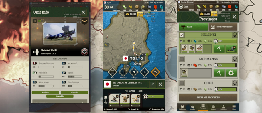
Revamped menu panels, which now have a cleaner, more modern design, and most importantly, it’s easier to navigate in the midst of a heated battle. Whether you need to call for help, reach out to a comrade, or access the map, it’s all now as simple as ABC.
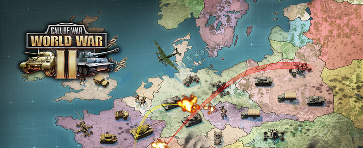
Although the historic accuracy remains, the look of the maps is one of the most noticeable visual changes, now showing slicker lines but keeping the rustic look of a real battle map.
Like a seasoned general would do, you can now create their own command center by pinning all armies, provinces, and units in one place, giving them instant access to their arsenals when calling for backup.
Does This Mean That The Gameplay Has Changed In Any Way?
Luckily for our hardcore long-term strategy fans, the gameplay remains as challenging and intense as always. Our team was careful to maintain the same revitalizing feel of intense battles while focussing on improving the design and functionality of Call of War‘s interface.
All improvements are available now in the desktop version, as well as on iOS and Android devices.


